Chegg’s leadership had long been cautious about changing the Plans & Pricing page, fearing any impact on conversion. But with brand guidelines evolving and the existing experience feeling outdated, there was an opportunity to modernize the page and build more trust with users.
The direction was simple: be bold.
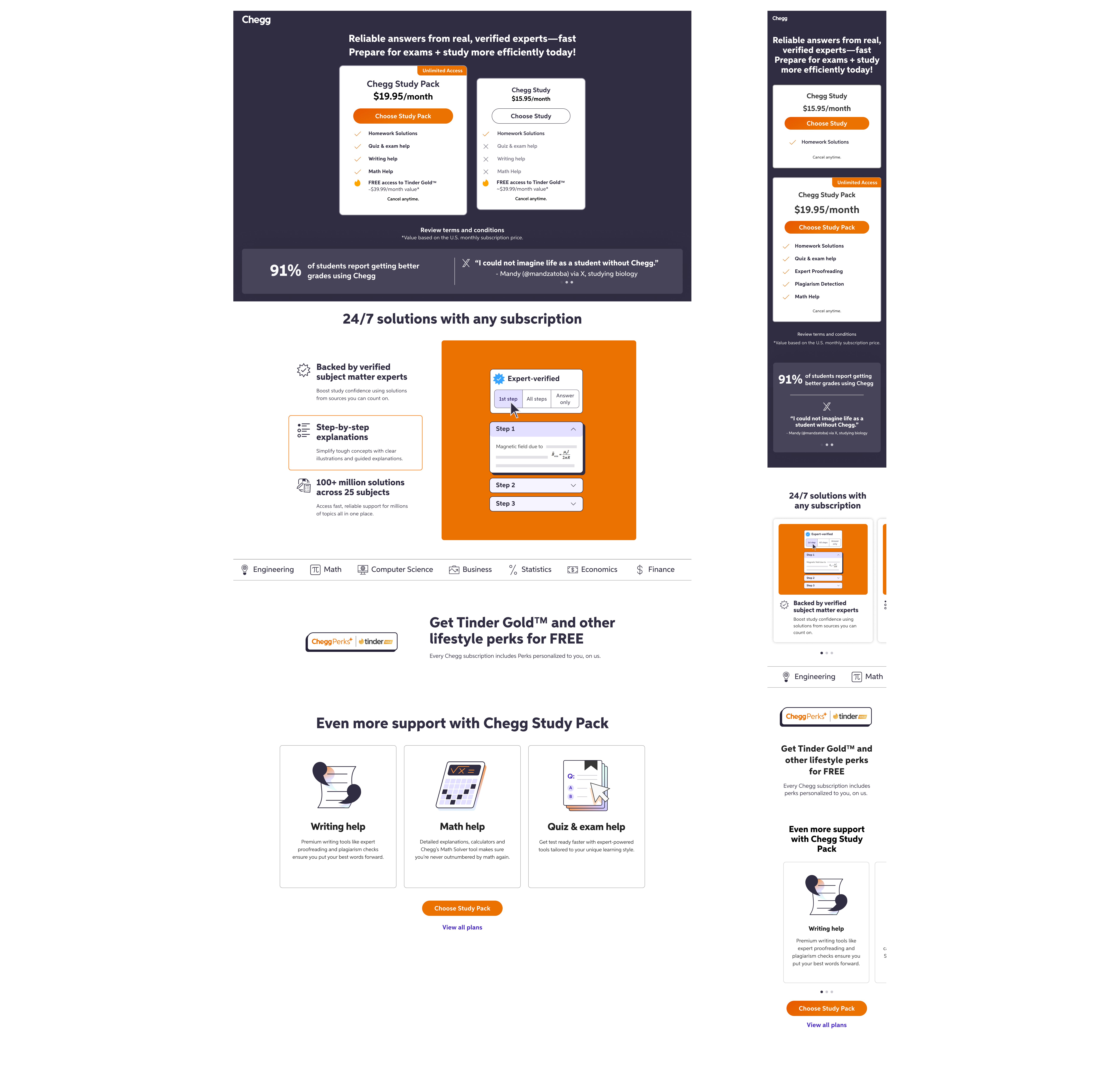
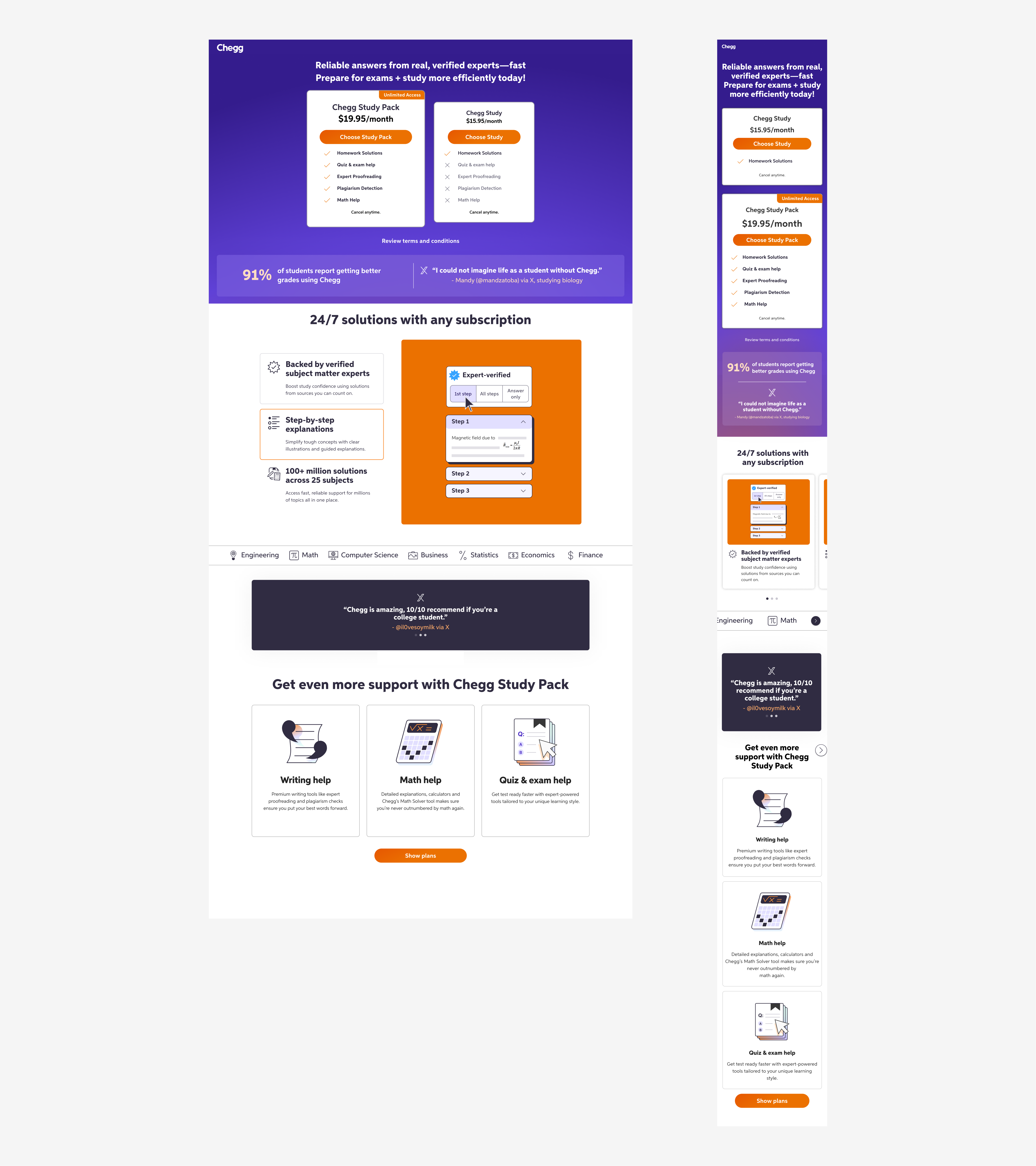
The page was confusing, lacked transparency, and didn’t clearly communicate what students were getting with a subscription. The challenge was to redesign it to feel cohesive with the new brand direction, improve clarity and trust, and ensure there was no harm to conversion.

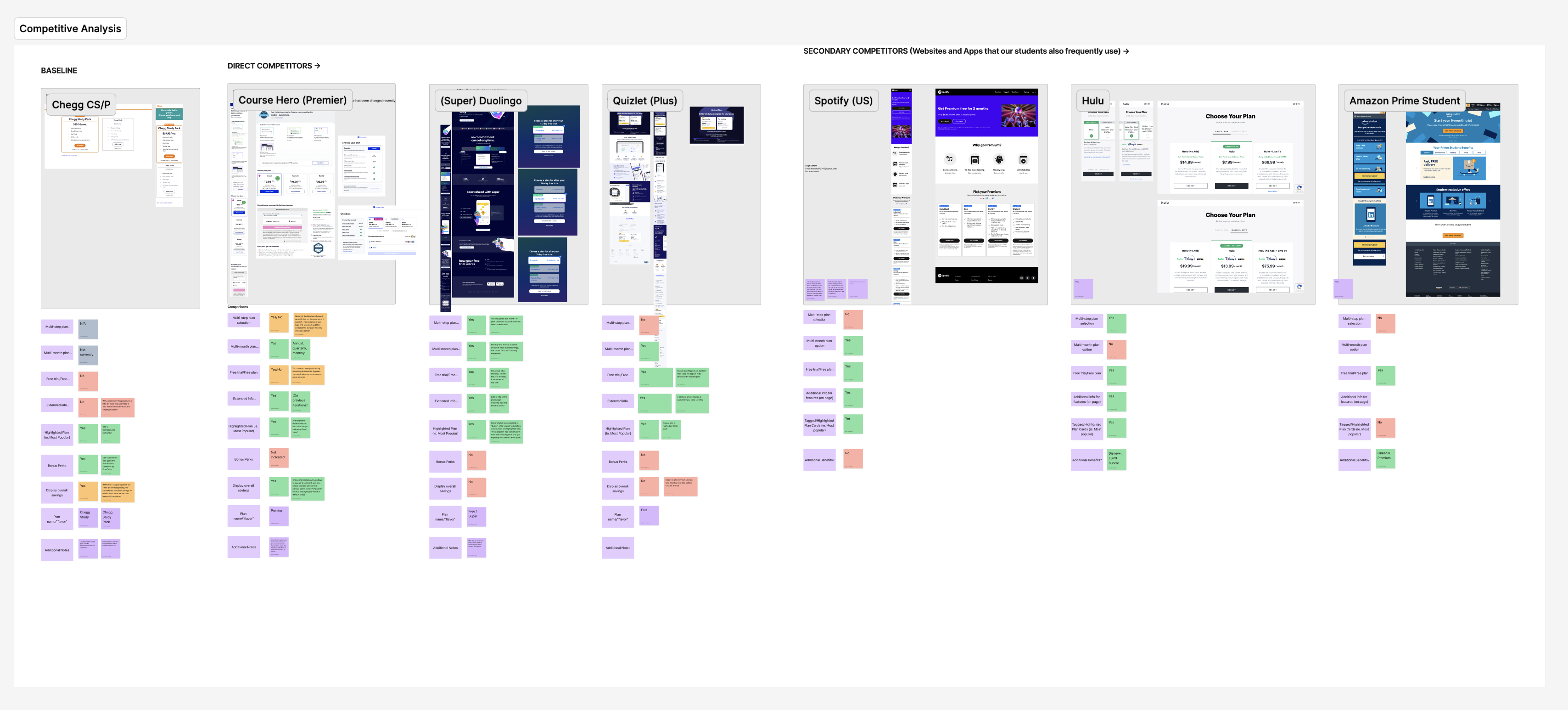
The Senior Product Designer and I started with a competitive analysis, looking at how other subscription-based products presented plans, used visuals, and created dynamic, informative experiences. Prior research already showed that students wanted transparency and clarity: they wanted to understand exactly what they were paying for.
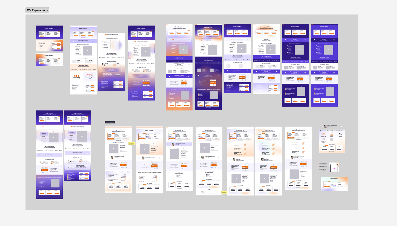
I designed wireframes and explored ways to make the page feel more engaging and informative.
By then, I also had a lot of experience working on the nonsubscriber side of the business and Chegg’s marketing landing pages, so I used past research and data, like heat maps, unmoderated interviews, and A/B testing results, to shape the design of the page.
Every section of the page was intentional and research-backed, from the inclusion of our most popular subjects to the darker background above the fold.

It quickly became clear that we needed stronger visuals and animations to help tell the story. I advocated for bringing in visual designers from the Creative Marketing team and facilitated collaboration between them and the product team, breaking down silos that had existed for a long time.
This partnership set a precedent for how the two teams could work together going forward.
The redesigned Plans & Pricing page not only improved transparency but also strengthened alignment between product and brand. The experiment results spoke for themselves:
+ 4% lift in conversion
+ 124K acquisitions
+ $5.5M in revenue
The project also paved the way for more motion and storytelling across Chegg’s surfaces. This was proof that bold, collaborative design could drive both brand and business impact.
For the duration of the project, one of our biggest pain points was working with a brand guideline that was actively undergoing a major update.
Once the design scaled to 100% of users and the guidelines were solidified, the Creative Marketing team released these designs. No significant changes were made to the framework of the page, underscoring the success of the big redesign.